
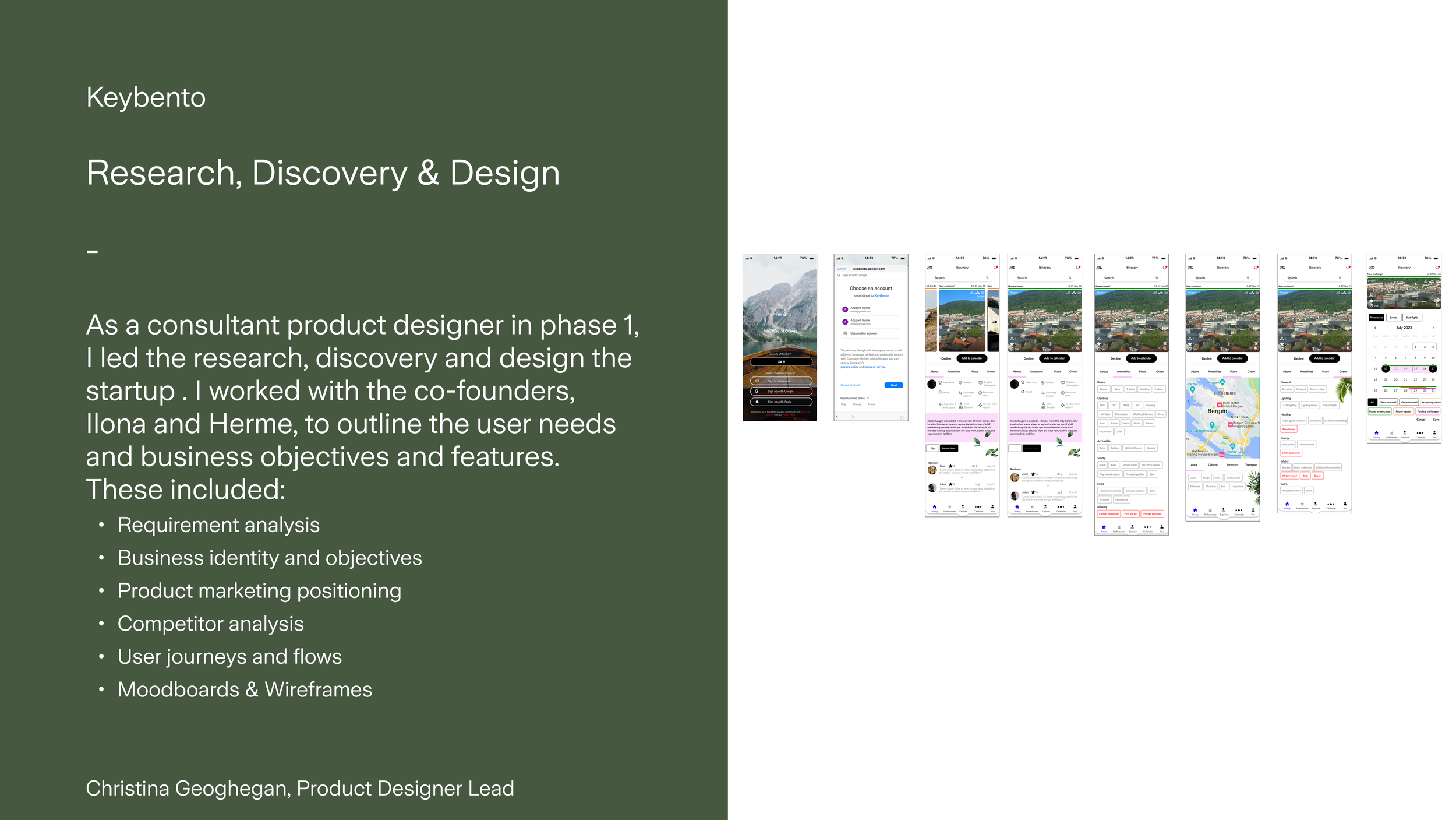
Research
We ran into an interesting dilemma; the problem statement that had initially existed as a primary motivator for the startup was vague. When I conducted competitor analysis, we had the opportunity to define it further to establish key product offerings and to differentiate ourselves. This involved many iterations of exploring the functionality within the app through workshops with the co-founders, generating more ideas for the product, and gaining more clarity on the operations. Clarity in the product in this early phase would later be instrumental in guiding and defining the experience for the user.
House swapping and rentals were prevalent across the industry. Kindred, Third Home, and Love Home Swap, accommodated a niche from luxury to low budget.
Problem statement
The user doesn’t want the pressure of swapping. They want the flexibility to book and host when they like, no need to swap at the same time. The prices are too high. They don’t know if places are available for families 100% of the time
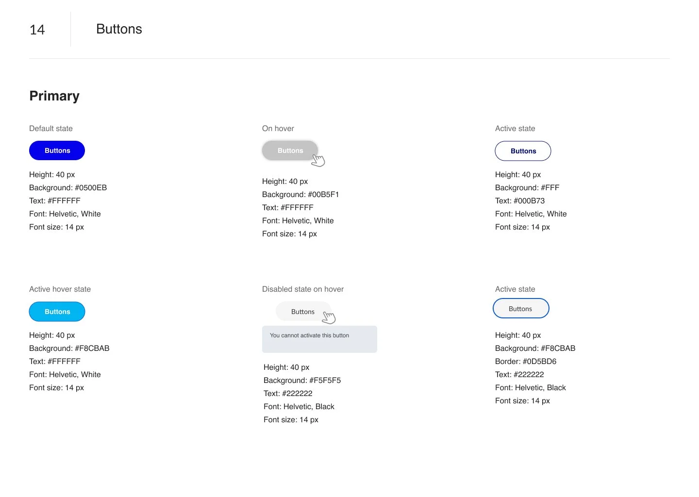
Design system
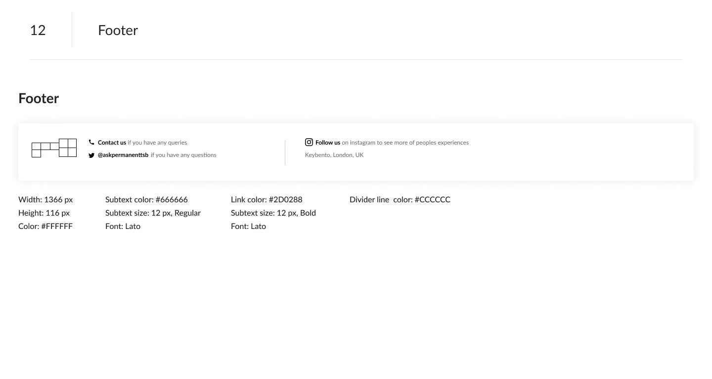
A comprehensive design system was put in place, reviewed at each stage to validate the states of the product. Mobile first was part of the preliminary designs .
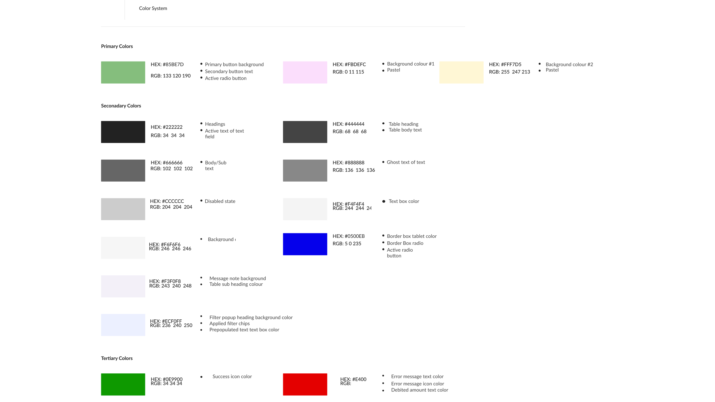
We deliberated whether a dark green or bright blue would be the primary colour. A soft green would be the trademark colour, symbolising nature, approachability, trust, warmth, and growth.
Below are samples of the early design system boards.
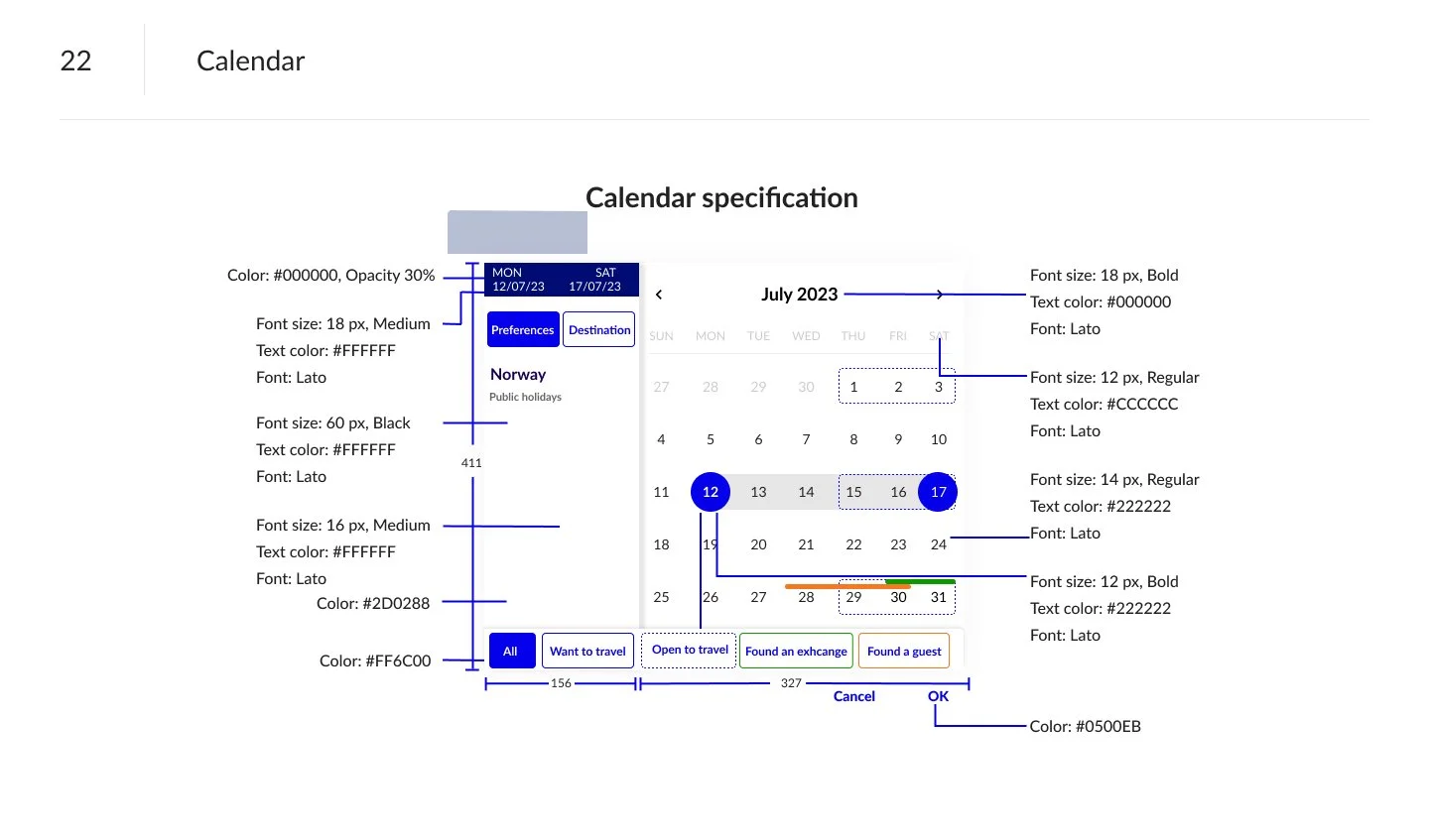
The calendar was a central piece of user navigation. To avoid confusion or errors, it needed to be simple to scan and convert essential information. We considered the following states.
Available
Tentative
Not available
Direct swap available
User Journeys
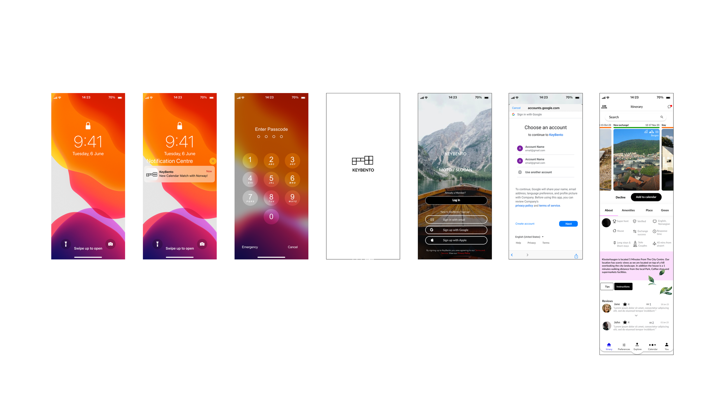
An onboarding process was designed. Users indicated they would like to explore the app before going through a profile set up. I wireframed a flow where users with locations setting on would be ablet to see a sample of immediate family homes available without users privacy breached.
Once a user was verified and set up, then they could continue the user journey to find more homes and details about stays they wished to exchange with or host.
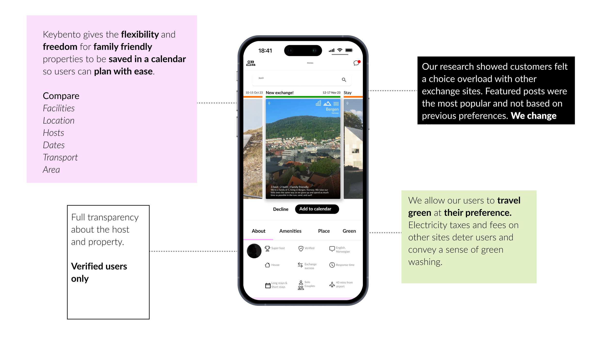
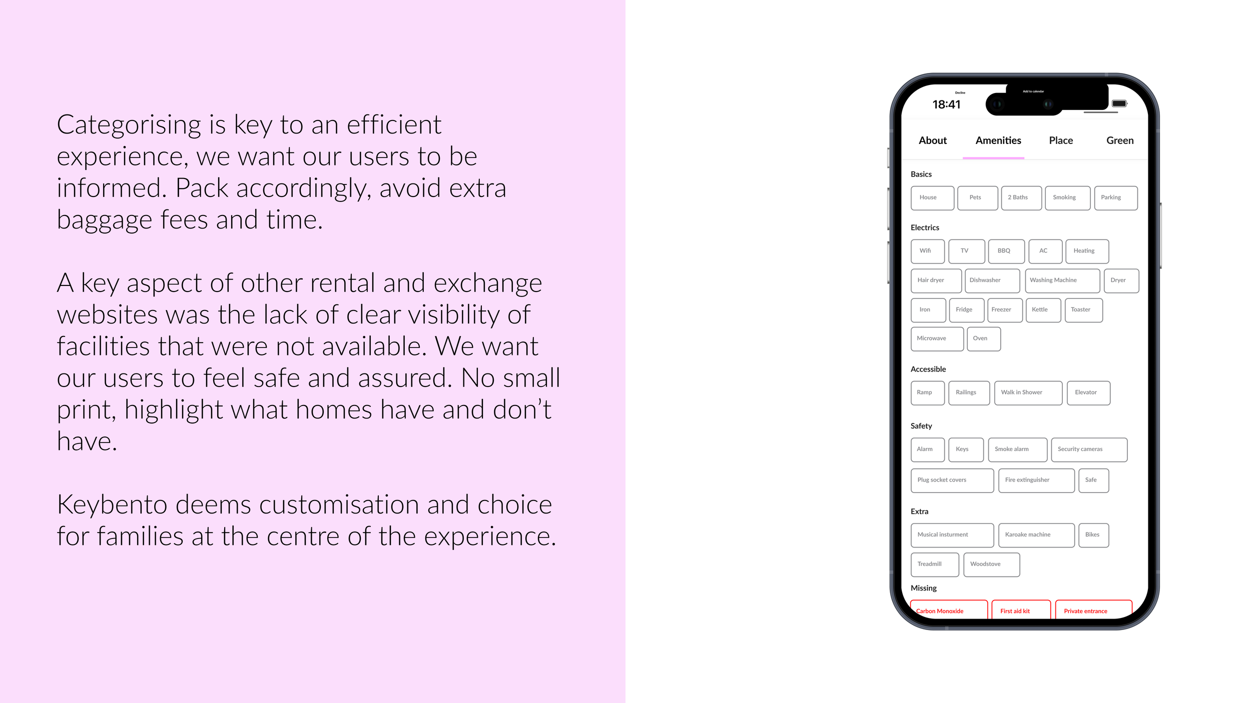
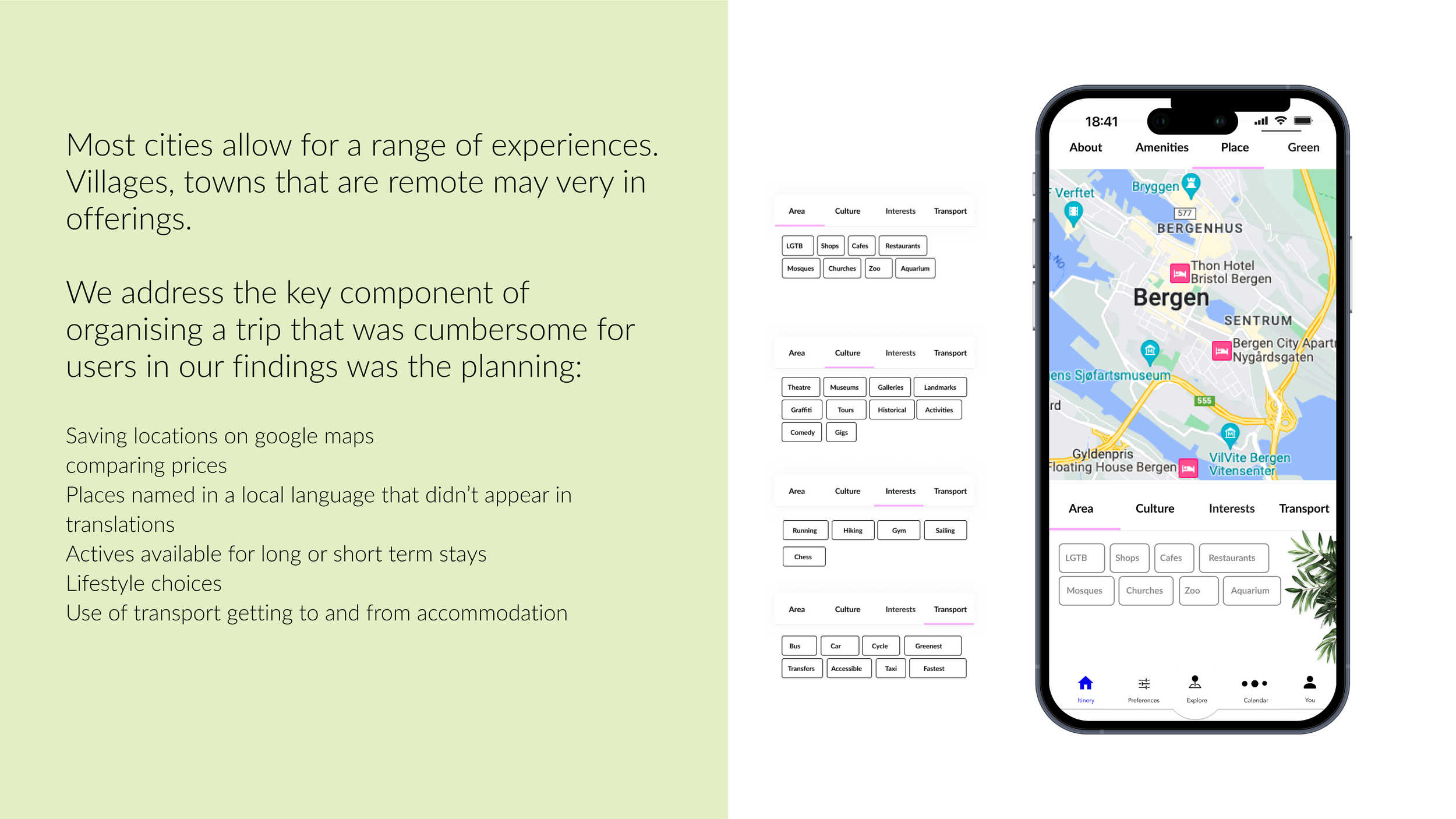
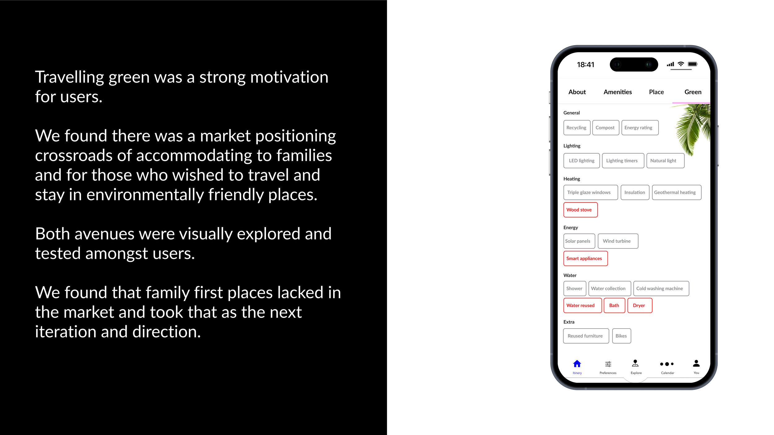
A customisable selection of amenities was included in line with other hosting sites and industry standards. The user had an expectation of what to expect and the options available. However, an added section was understanding what type of home swap for work or for leisure users would like. As illustrated in the sample below, we hypothesised a selection of activities based on the lifestyles the user wanted to lead whilst there.
Mobile customisation was a key attribute in the selection feature. How do they want to spend their vacation?
Future work
Our first round of funding changed the parameters in order to build an app. We pivoted from mobile first design to a web page.
Despite travelling green no longer being the forefront of our business model. Users responded well to the approachable design system. As it was now family first oriented we adapted the experience towards a pastel colour palette.
Keybento continues to accommodate families exchanging homes, providing safe, affordable options to travel, work and go on holiday.
In the research and discovery phase we executed many features and choices for users to implement in future releases as Keybento grows.