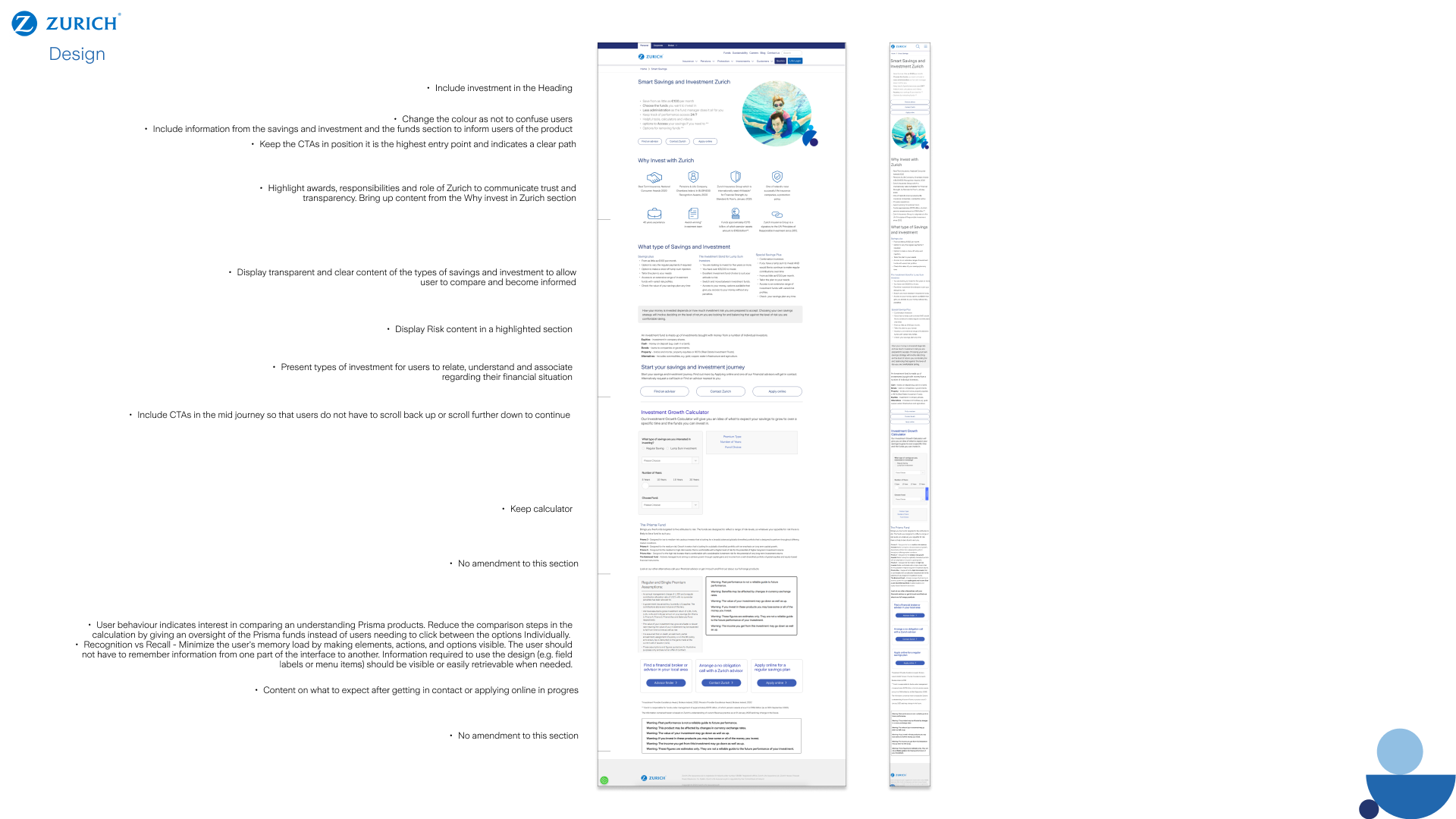
Considerations
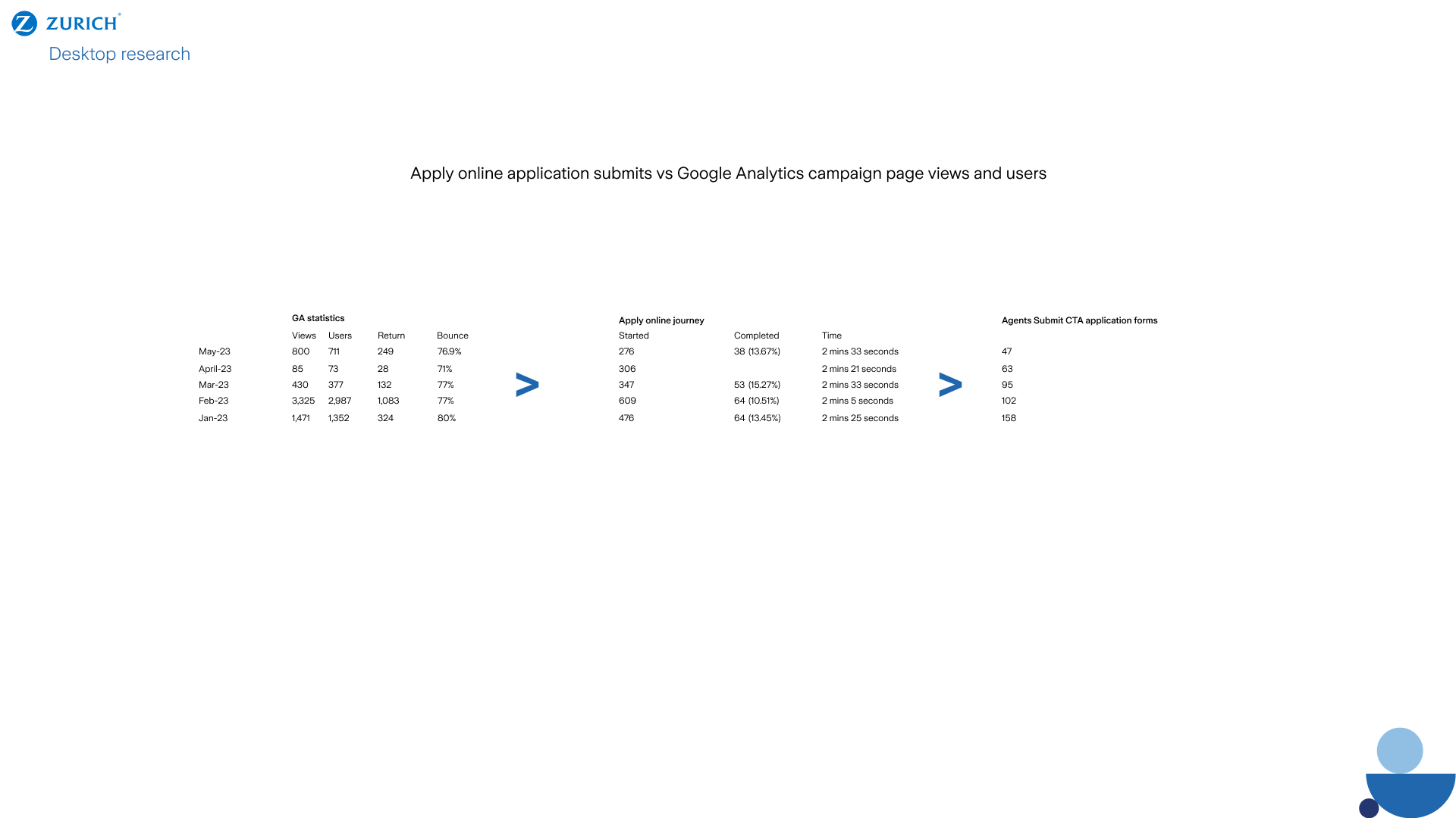
We were legally obligated not to compete with our brokers, despite the necessity to increase user traffic directly through our sites “"Apply online” journey during marketing campaigns run by Zurich Ireland, supported by Zurich.
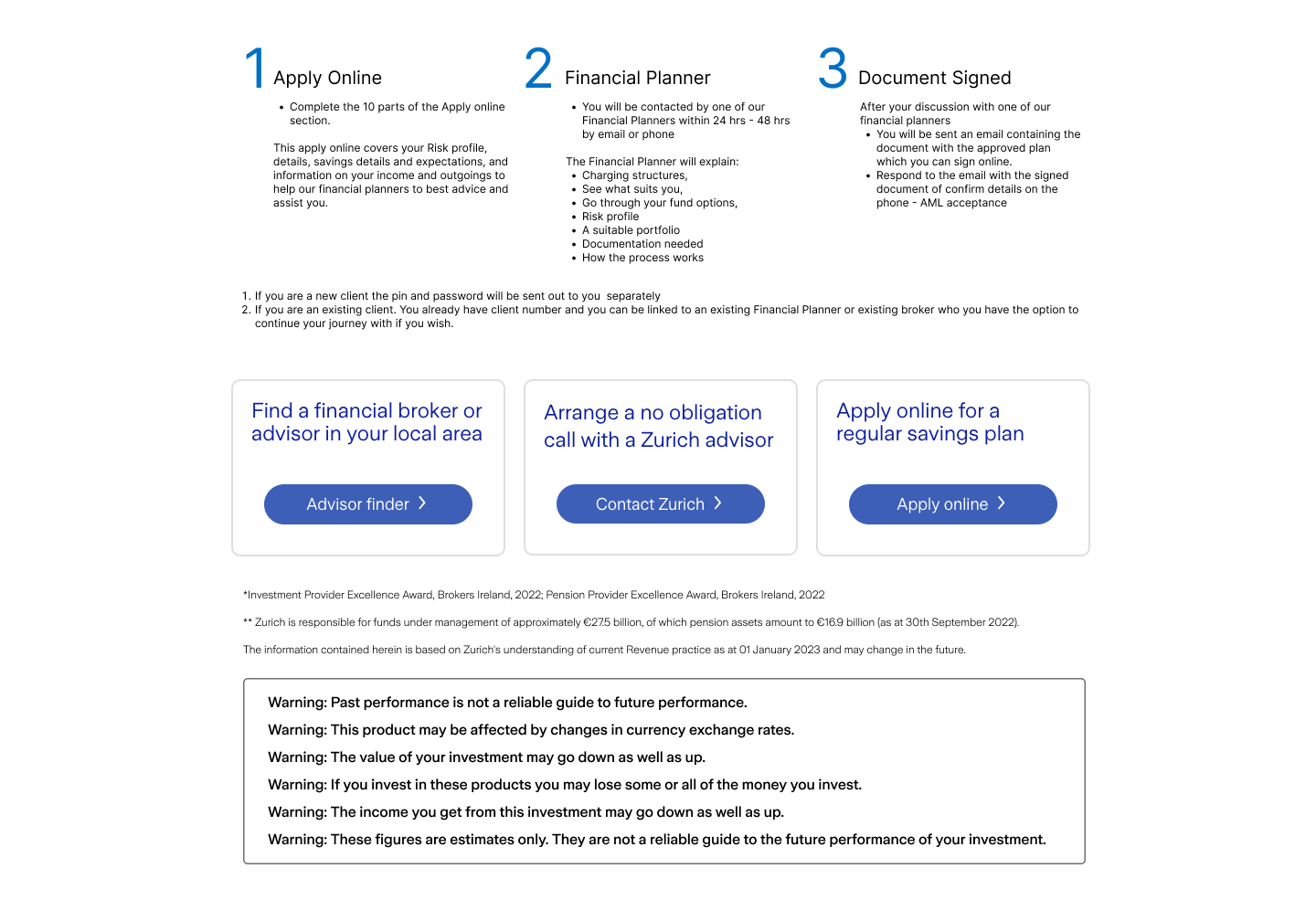
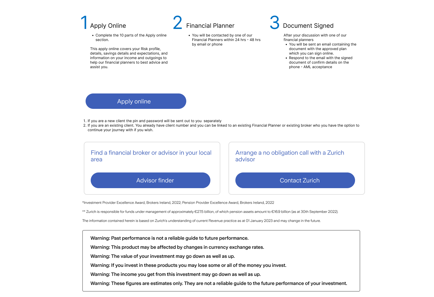
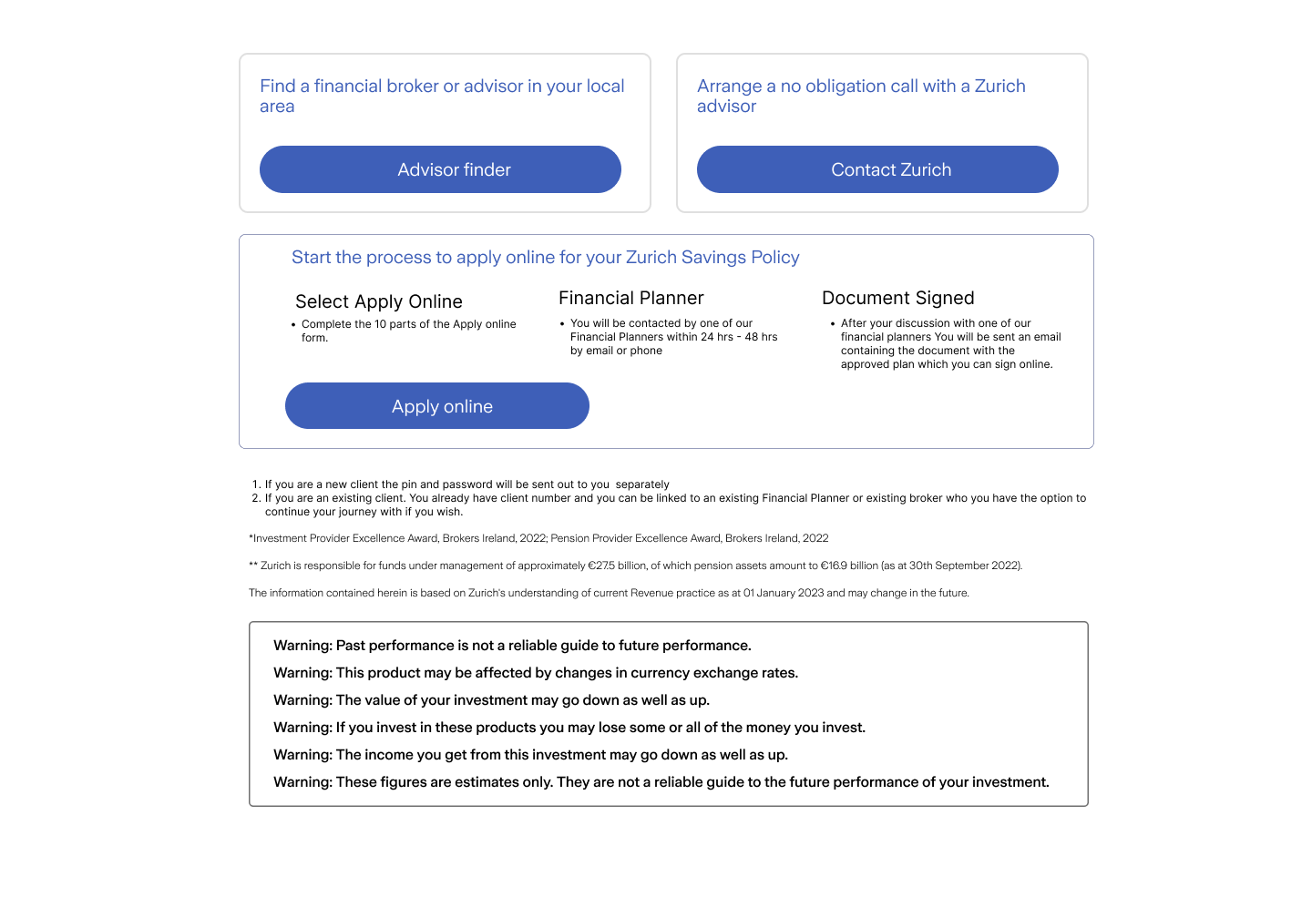
Options available to users:
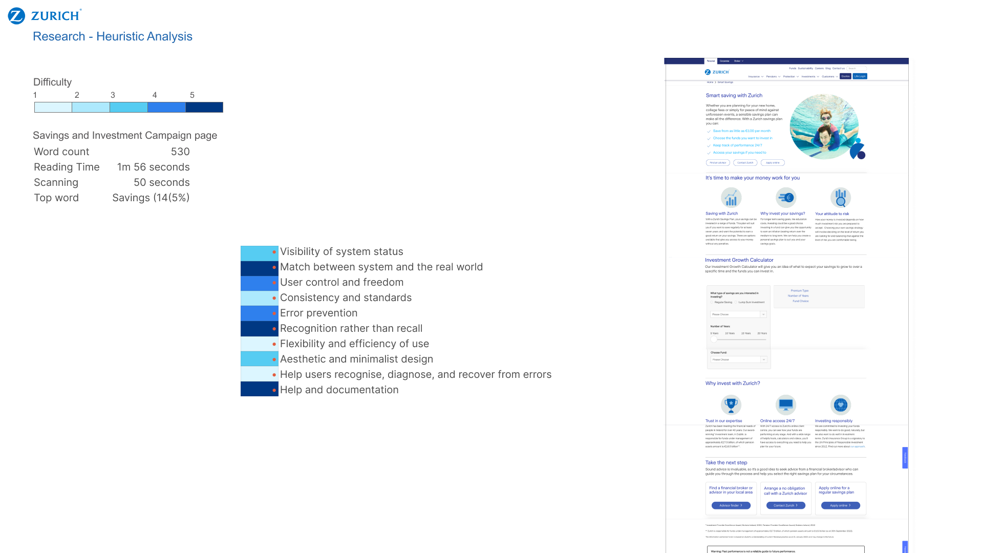
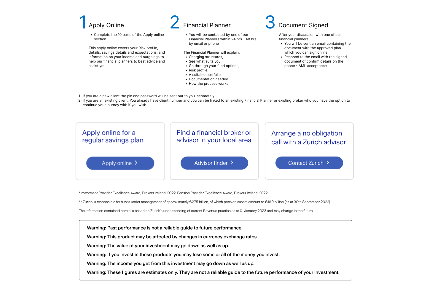
Broker | Zurich advisor | Apply online
We could not contain elements such as nudging, highlighting, framing, copywriting or visual differentiation to guide and encourage users to proceed with the “Apply online” journey.
Solution
To adhere to our brokers, I employed Gestalt’s design principles, incorporating proximity, similarity, and continuity. I liaised with the legal and marketing teams to validate and iterate solutions.
I proposed the Goldilocks fallacy to prompt users’ subtlety by displaying the 3 options. Users in groups of 3 tend to remember the 1st and last item.
By positioning the brokers first, we illustrated the steps a user would have to take to continue, creating friction and potentially cognitive overload. Locating the talking to an advisor next presents a stark contrasting option, the task is easy, although, a user may feel obliged to follow through. Situating Apply online last, the user remembers this option and offers control and freedom without engaging with larger tasks of finding a broker and without the pressure to commit to talking to an advisor.
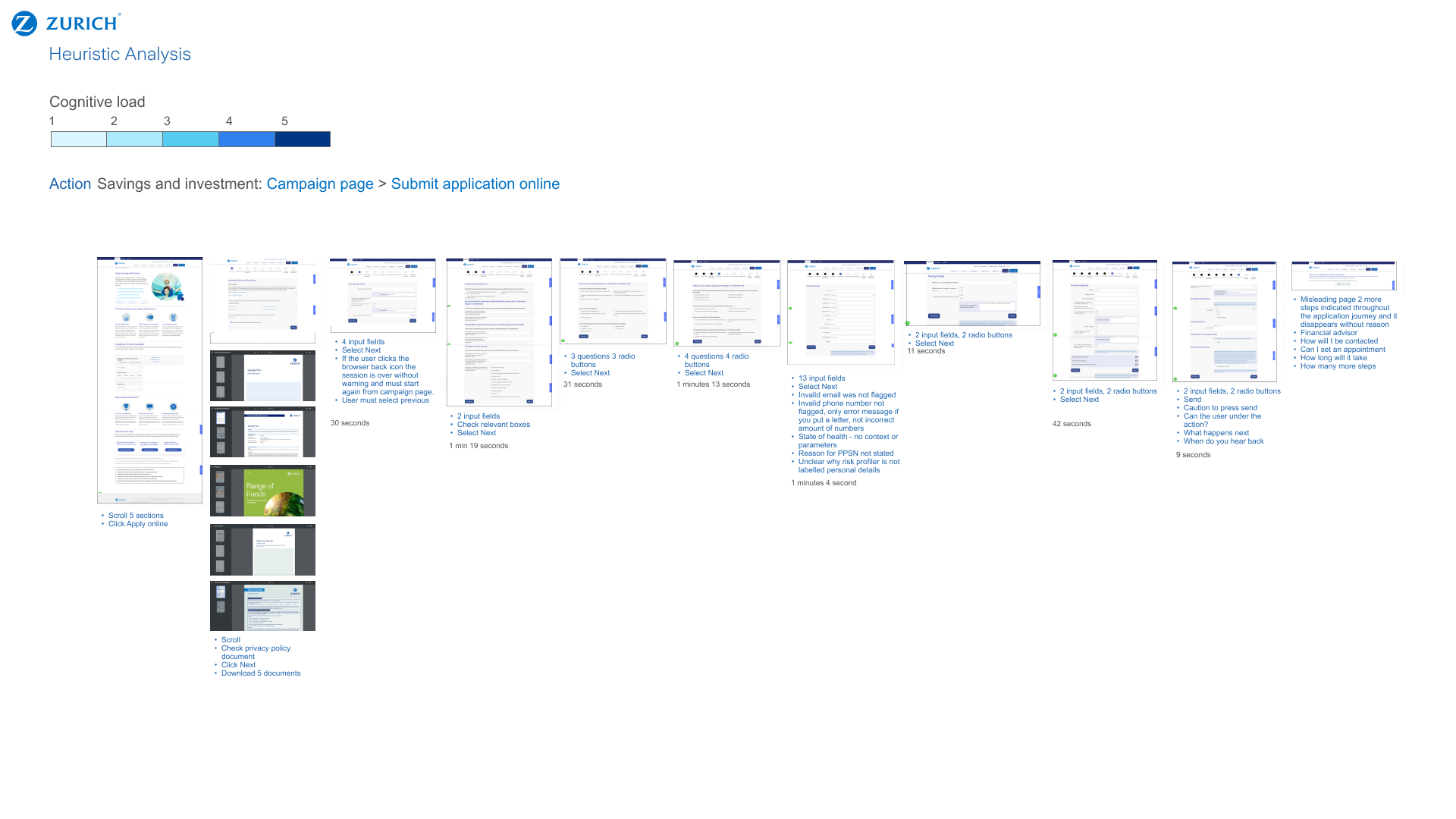
Apply online journey
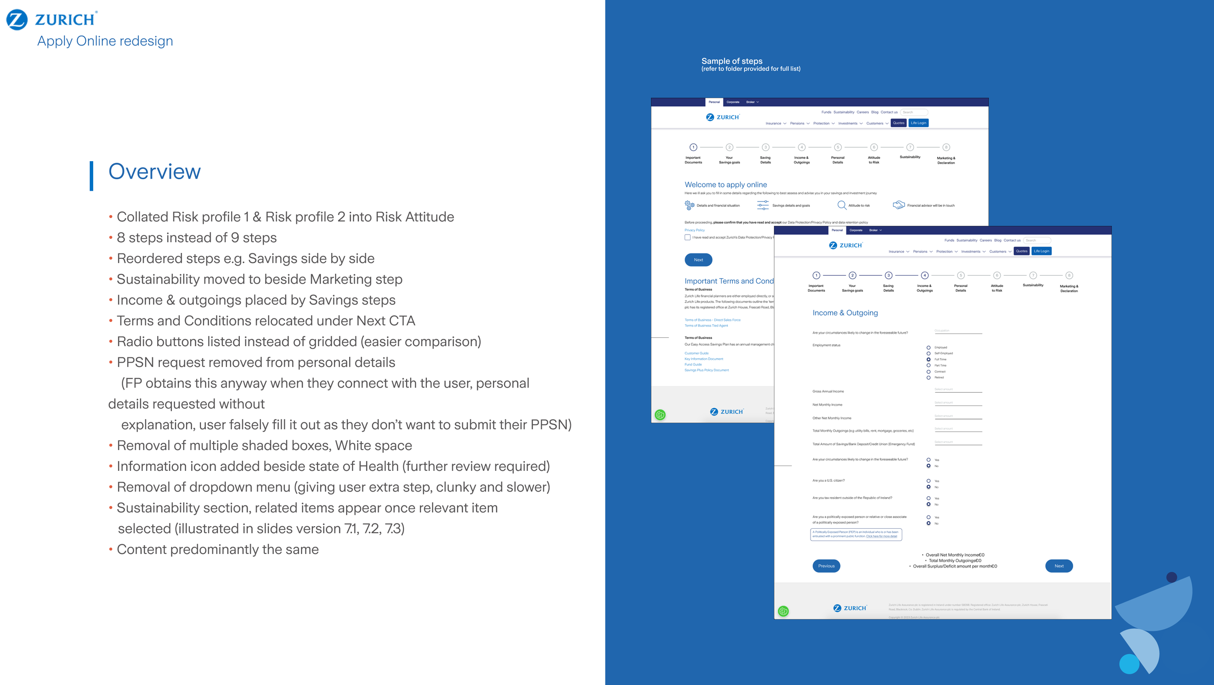
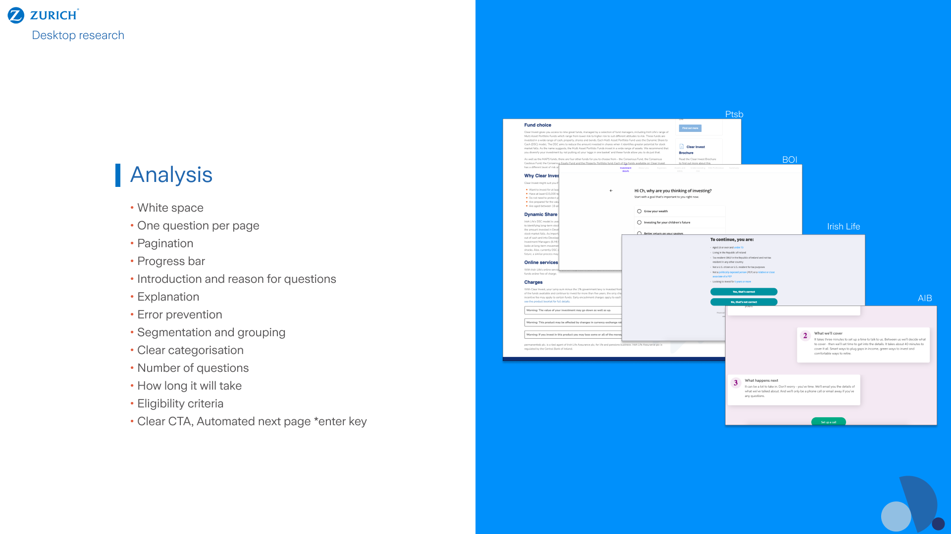
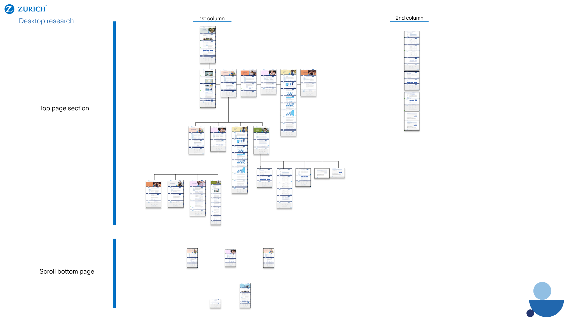
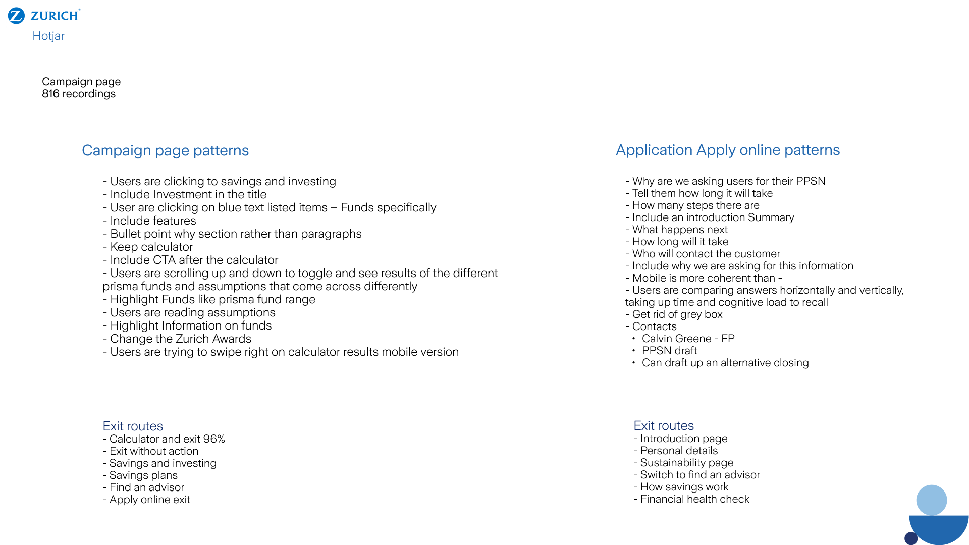
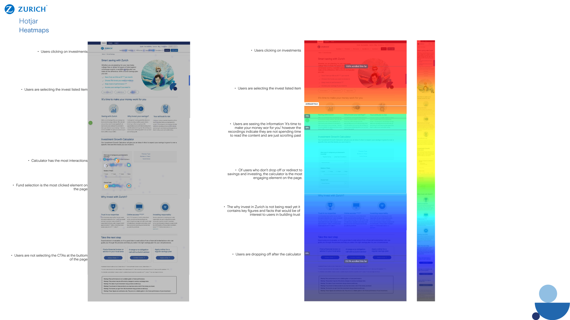
Our Apply online process had many interactions and information components that prohibited users from finishing the journey, and a high bounce rate (64%). Limitations on budget and the approaching deadline of the global marketing campaign resulted in changes that had the highest impact and lowest monetary impact and dev time. The existing design was bulky, required too many input fields, and was unclear to users about investment options and how to select the options. Lacked clarity on the duration and required documentation. necessary to complete the journey.